Contact me by email at ease — I typically respond within a day or so!
24.0.2 Announcements
CautionAnnouncements
Final Exam Accommodations Form opens Thursday — please make sure to fill it out if applicable.
The Project 3 Partner Form will be shared once released — check your email!
NoteNote
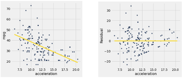
In data science, we can use linear regression in order to make predictions. When making predictions, it is also important to assess the accuracy of our predictions. To do so, we can examine the error between our actual data and the predictions; these errors are called residuals.
An example can be found below in the graph of miles per gallon (mpg) compared to the acceleration of a car. The left scatter plot shows the original data with a regression line fitted to it, and the right plot shows the corresponding residuals.
Key facts:
residual = actual value of \(y\) − predicted value of \(y\)
When we perform linear regression with an intercept, the sum of the residuals will always be equal to 0.
In a well-fitted linear regression, the residual plot shows no pattern, and the residuals sum to 0.
When a residual plot shows a pattern, there may be a non-linear relation between the variables.
If the residual plot shows uneven variation about the horizontal line at 0, the regression estimates are not equally accurate across the range of the predictor variable. This is known as heteroscedasticity.
24.1 Visual Diagnostic
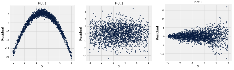
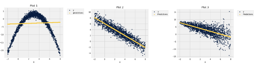
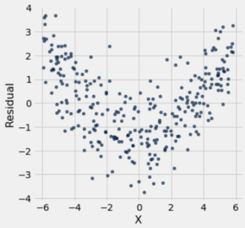
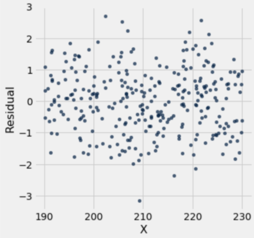
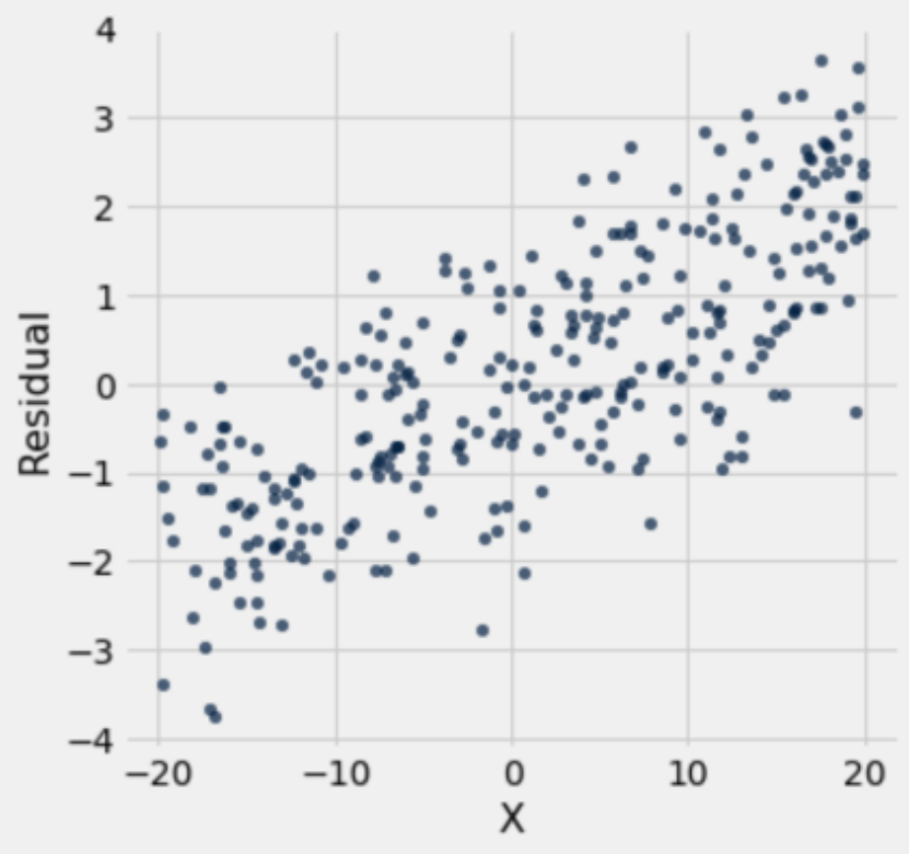
Displayed below are three residual plots. For which of the following residual plots is using linear regression a reasonable idea, and why? What might the original graphs have looked like?
Answer
Plot 1 exhibits a clearly non-linear pattern which tells us that using linear regression is inappropriate. Plot 2 is the best residual plot to use linear regression for, since the residuals have the pattern of a formless cloud. Plot 2 satisfies the two things that we are looking for:
The sum of the residuals add up to zero
There is no observable trend or pattern in the residuals.
Using linear regression for Plot 3 is a mixed bag, as the data still seems to follow a linear pattern but the residual plot is heteroskedastic, meaning the residuals are more spread out for different values of \(x\). One consequence of heteroskedasticity is that our predictions will be less accurate, and although there are ways of combating heteroskedasticity, directly applying linear regression to the sample would not be appropriate.
Here are the original graphs:
NoteTrend vs. Pattern in Residual Plots
Trend: general upward or downward linear movement in data.
Pattern: any kind of structure or regularity in the data (all trends are patterns, but not all patterns are trends).
Tip: specificity matters. If unsure, describe the relationship (linear/nonlinear) rather than misusing terminology.
NoteResidual Plots and Linear Regression
By construction, residual plots from linear regression (with intercept) will never show a trend (no linear relationship between x and residuals).
Nonlinear data may show a pattern in the residual plot.
Heteroskedasticity: variance of residuals changes with x.
Textbook note: “If the residual plot shows uneven variation about the horizontal line at 0, the regression estimates are not equally accurate across the range of the predictor variable.”
Out of scope: it also biases the SD of regression estimates.
24.2 Fight for California!
At a Cal football game the Mic Men, who are spirit leaders, claimed that our opponent’s ability to score was linearly affected by the student section’s noise level. Noah thinks they are wrong. Instead, he believes there is no linear relationship between student section noise and opponents’ scores. A friend gives Noah a table called noise which contains the following information:
Opponent: Cal’s opponent for the game.
Loudness: Each row represents the maximum noise in decibels produced by the Student Section when Cal is on defense during a single home football game. (These are fabricated by Noah’s friend.)
Points: The number of points scored by the opposing team.
A sample of the table with data from the 2024 season is below:
Opponent
Loudness
Points
UC Davis
65
13
Auburn
55
14
San Diego St
75
10
Miami FL
85
39
Pittsburgh
70
17
Stanford
120
21
NC State
100
24
NoteNull/Alternative Hypotheses for Regression
Focus on the population parameter (true slope/correlation).
Correlation of zero → regression slope of zero.
Combines concepts from hypothesis testing, bootstrap, and confidence intervals.
Noah thinks that there is no correlation between Loudness and Points and that the Mic Men’s claim is wrong. How can Noah test his hypothesis?
Null Hypothesis:
Answer
There is no linear association between Loudness and Points. The true correlation is 0. The non-zero correlation observed in the sample is simply due to chance.
Alternative Hypothesis:
Answer
There is a linear association between Loudness and Points. The true correlation is non-zero (there is some linear relationship between the two variables). The non-zero correlation observed in the sample is not simply due to chance.
Testing Method:
Answer
We are essentially trying to estimate the true value of \(r\). Therefore, we can bootstrap the sample repeatedly, generate a confidence interval for \(r\), and check to see if zero is included in the confidence interval.
24.2.2 (b)
Noah decides to write a function which produces one bootstrapped estimate of the correlation between Loudness and Points. Define the one_relationship function below which takes in the following arguments:
tbl (Table): a table that contains a sample and has the same columns as noise.
x_col (string): the column name for the \(x\) variable.
y_col (string): the column name for the \(y\) variable.
The function should return one bootstrapped estimate of the correlation coefficient \(r\). You can assume that you have access to the function correlation(x,y), which returns the correlation between arrays \(x\) and \(y\).
Use a correlation function to resample and estimate variability.
Key review: formula for correlation, make_array, and np.append.
Percentiles are used to determine confidence interval cutoffs.
one_relationship(noise, "Loudness", "Points")
0.82506602460295764
24.2.3 (c)
Noah decides to generate a 70% confidence interval for the true correlation between Loudness and Points using 1,000 bootstrap resamples. Fill in the following code to generate the interval.
______________________________________________________for i in ______________________________________________________: ______________________________________________________ ______________________________________________________lower_bound = ______________________________________________________upper_bound = ______________________________________________________ci = make_array(lower_bound, upper_bound)
Any other variable name works, as long you’re consistent with it!
24.2.4 (d)
Noah enjoys chaos so he decides to swap the x_col and y_col arguments each time he makes a call to one_relationship inside his for loop. Will this impact his interval?
Answer
Correlation does not change if you change which variable is on each axis. Therefore, Noah can swap the axes and the interval will still be generated correctly, although it will likely be a little different since the process is random!
NoteCorrelation Understanding Checks
Correlation does not depend on which variable is on the x-axis.
Even with a strong correlation, correlation ≠ causation.
Confidence intervals reinforce uncertainty and caution in interpretation.
After running the above code Noah gets an interval of [−0.75,−0.14]. Can the Mic Men claim Noah is wrong and that crowd noise levels have a direct causal effect on opposing team performance?
Answer
While we reject the null hypothesis that the correlation coefficient is 0 at the 70% confidence level, they cannot claim that there is a direct causal effect between student section noise and opponents’ scores. First, the data was simply observed so there could be confounding factors such as opponent quality. Additionally, we could be observing reverse causation (i.e., instead of “maybe X causes Y” it’s “maybe Y causes X”) where points being scored by the opposing team may instead be affecting the student section noise levels.
24.2.6 (f)
Regardless, Cal Athletics wants you to generate a line of best fit for your data. Should you use the method of least squares (i.e., minimizing RMSE) or the regression equations? Is there a difference between the two?
Answer
It does not matter which method you use; they both result in the same line. This also means that the regression equations give you the unique line that minimizes the RMSE!
NoteLeast Squares vs. Regression Line
Least squares line and regression equations line are the same; both minimize RMSE.
Students can take this as fact in Data 8; derivation will be covered in advanced classes.
Can be proven via matrix calculus, orthogonal projections, etc.
24.3 Rogue Residuals
Each of the following plots is a residual plot from an attempted linear regression of a variable \(y\) on a variable \(x\). For each one, indicate whether the regression line seems to be a good fit, or seems to be a bad fit, or if it is invalid for a well-fit regression.
NoteInterpreting Graphs for Regression
When evaluating potential regression lines, it’s helpful to draw multiple hypothetical lines and visualize their fit to the data.
Ask yourself:
Does the line capture the overall trend of the points?
Are there obvious points that the line cannot pass through?
Would the residuals (differences between observed and predicted values) show a pattern?
Part D-type questions often test your understanding of what is possible vs. impossible for regression lines given the data.
Key tips:
Residuals should be randomly scattered with no trend for a good linear fit.
Lines that systematically over- or under-predict at certain x-values are usually incorrect.
Visualizing helps connect the slope, intercept, and fit quality.
Practice drawing a few lines and comparing them to the data before concluding which line makes sense.
Helps develop intuition for:
Why some regression lines are implausible
How patterns in residuals indicate model issues
How to anticipate the slope and intercept given the scatter of points
Plot A
Answer Explanation
Invalid residual plot, since the sum of residuals is not equal to 0. Though this is an invalid residual plot, as in it would never exist with a well-fit regression, it is still appropriate to conclude the underlying data is appropriate for regression.
Plot B
Answer
Parabolic shape in the residual plot, therefore linear regression is not appropriate.
Plot C
Answer
No visible pattern in the residual plot and the residuals seem to sum to 0, so the regression fits well.
Plot D
Answer
The regression line tends to overestimate for \(x<-10\) and underestimate for \(x>10\). We can change the slope to produce a better regression line, which shouldn’t be possible because the regression line minimizes RMSE! This is an invalid residual plot, but the underlying relationship is still linear, as we see a linear trend in the residuals.