from datascience import *
import numpy as np
%matplotlib inline
np.random.seed(42)
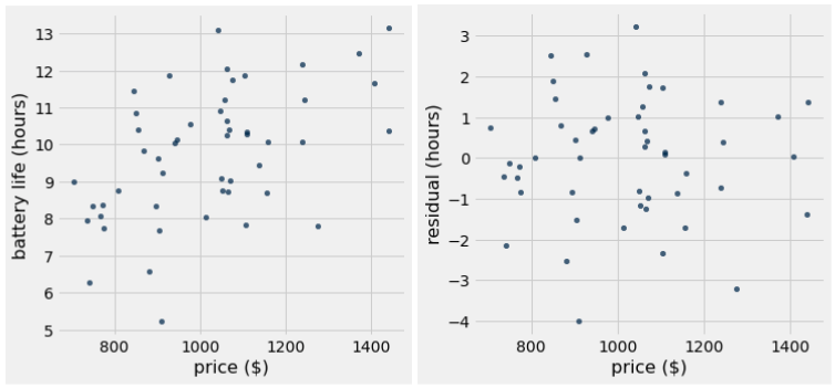
price = make_array(
750, 780, 790, 820, 830, 850, 870, 880, 885, 920, 930, 950, 955, 970,
980, 990, 1000, 1005, 1010, 1020, 1030, 1050, 1055, 1060, 1065, 1070,
1080, 1080, 1085, 1090, 1100, 1105, 1120, 1125, 1130, 1150, 1155,
1180, 1280, 1320, 1380, 1420
)
battery_life = make_array(
8.0, 8.2, 7.8, 8.5, 9.2, 10.0, 8.0, 11.0, 10.2, 10.0, 7.5, 5.3, 10.8,
6.8, 10.5, 8.2, 10.2, 8.8, 11.2, 9.0, 8.8, 12.0, 10.8, 11.5, 9.2,
10.4, 13.1, 10.2, 8.8, 11.0, 11.9, 9.5, 10.5, 8.5, 10.3, 11.5, 9.0,
12.2, 7.8, 12.5, 10.4, 13.2
)
laptop_data = Table().with_columns(
'price', price,
'battery life', battery_life
)